Friday, August 12, 2011

هاي قلة حيا و سرقه علي عينك يا تاجر من بنك الاسكان.... الله يقرفقوا فضحتونا... السرقه تكون بالعقل مش هيك


هاي قلة حيا و سرقه علي عينك يا تاجر من بنك الاسكان.... الله يقرفقوا فضحتونا... السرقه تكون بالعقل مش هيك...
  اعلان بنك الاسكان المنسوخ


Agency: Promoseven Kroma
Client: Future Vision Productions
Director: Bilal Alsurri
Post-Production: Nine Productions

Music: Qasim Sabonji


اعلان فودافون الاصلي


Heineken |This Is the Game

Heineken is celebrating its sponsorship of the Rugby World Cup, being held in New Zealand, September 9 to October 23, 2011, with “This is the Game”, a television commercial focusing on the code handed down from warriors of old. “Yes we wear dresses and yes we dance but this will never be drama class. We will respect a man’s anthem even he murders it. Never question the bounce. Who knows where this odd ball will go. Listen to the whistle man no matter how much he blows. Sleep when we are dead…” The 60 second “This is the Game” ad is supported by 10 second commercials ideal for play during the games, and an iPhone app “Kick Live Goals”.
Heineken This Is The Game


Heineken Kick Live Goals app


Credits
This is the Game was developed at Wieden+Kennedy Amsterdam by executive creative directors Eric Quennoy and Mark Bernath, copywriter David Smith, art director Craig WIlliams, and agency producer Cat Reynolds.
Filming was shot by director Steve Rogers via Revolver, Sydney, and Cherokee Films, Auckland, with director of photography Geoffrey Simpson, producers Katie Smith and Ian Iveson, executive producer Michael Ritchie.
Post production was done at Glassworks, Amsterdam. Editor was Bernard Garry at The Editors.
Music is “A Soldier’s Chorus”, from Gounod’s Faust, produced at Extreme Music, Berlin.
Heineken Rugby World Cup supporters

Tips on buying insurance

This article contains some useful tips. Read them, before you buy any insurance.

Coca-Cola Egypt – Say Like


Coca Cola Egypt has launched an online campaign called ‘Say like’. The new initiative includes a video on YouTube – with various people explaining the benefits of liking something – and a Facebook app called the Like ‘O’ Meter.
Project Say Like
Client Coca-Cola Egypt
Creative agency Elephant Cairo
Copywriters Maged Nassar, Ali Ali
Directors Ali Ali, Maged Nassar
Producer Hossam Fawzy
Exposure YouTube, Facebook

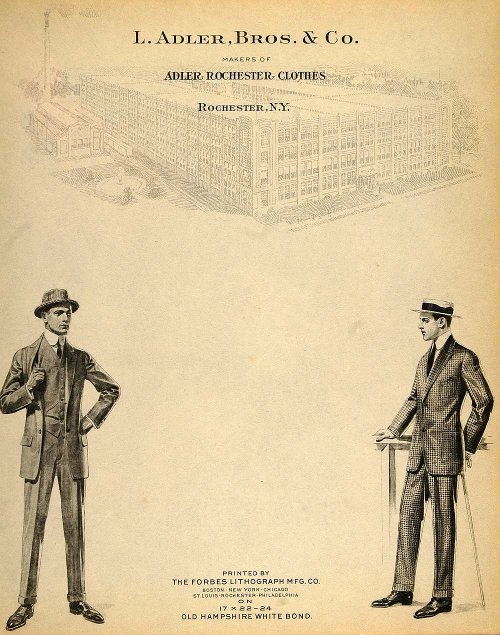
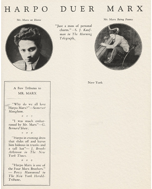
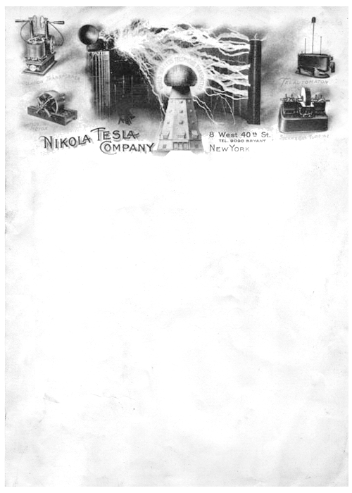
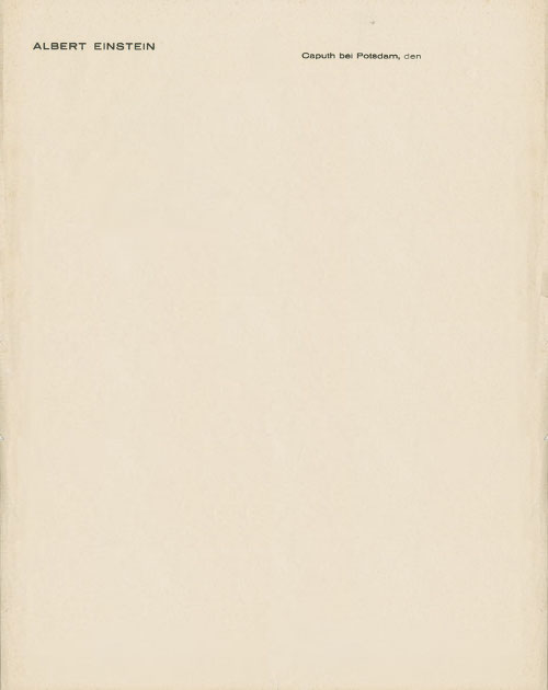
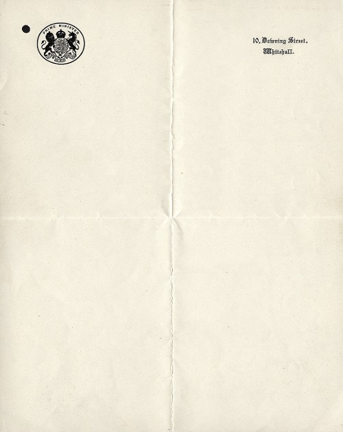
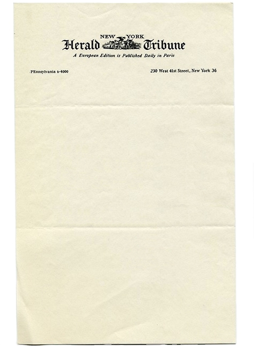
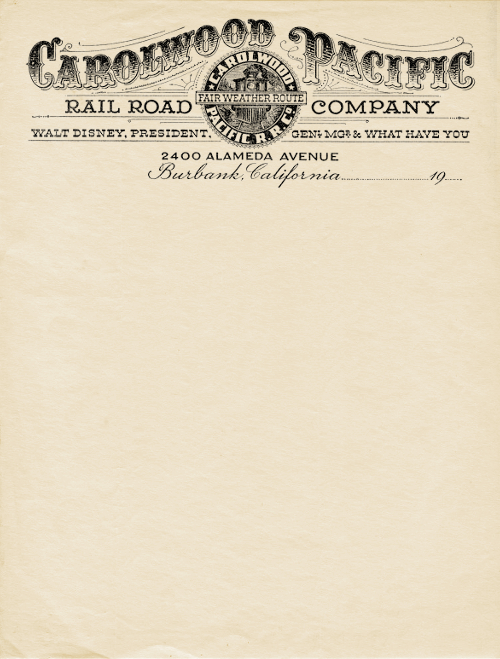
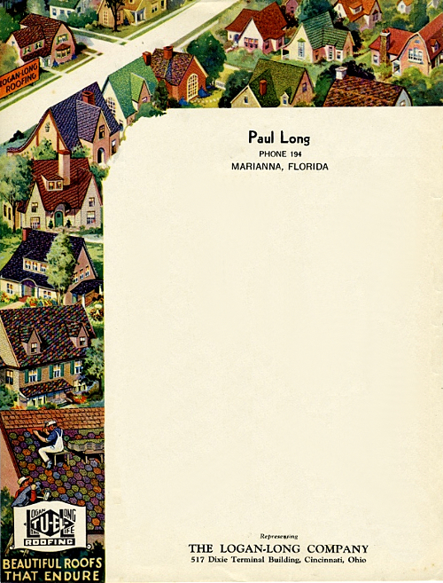
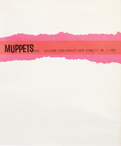
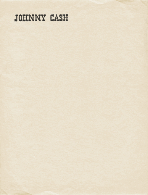
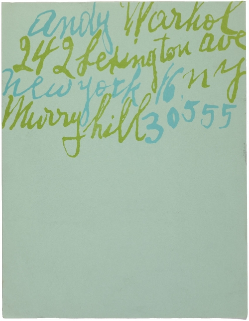
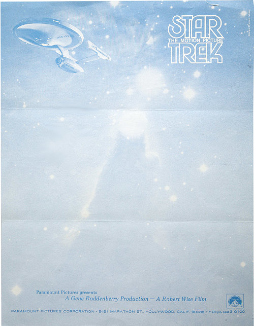
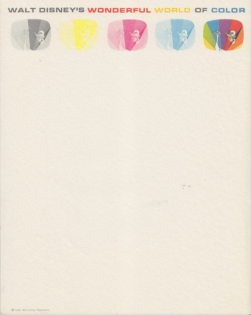
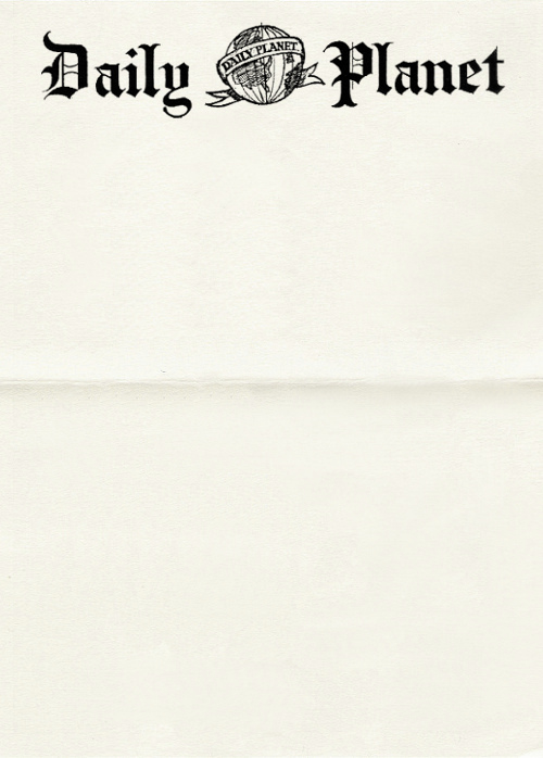
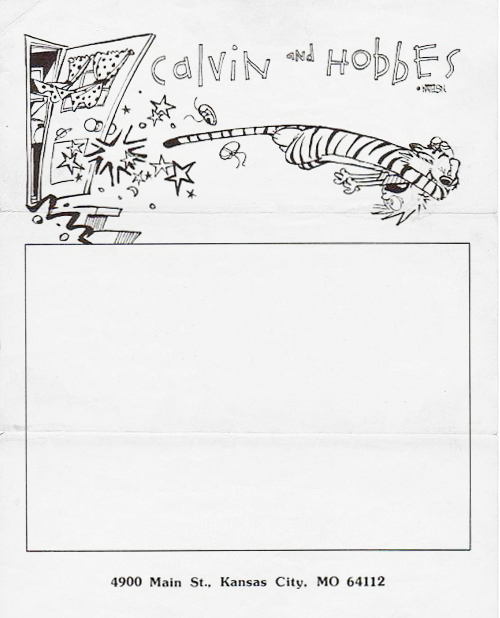
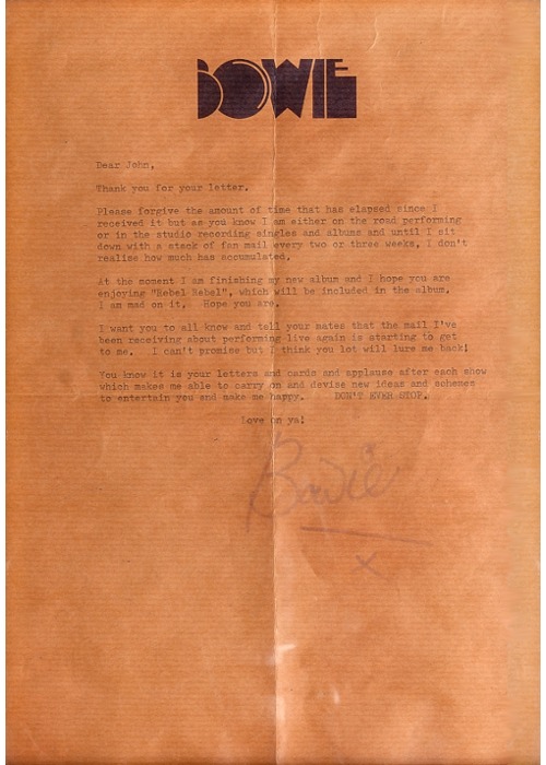
Letterhead Evolution


Long before people have been sending messages to one another. Before paper was invented,  people used different materials for their letters, they used leather, clay, plant leaves and papyrus.  As time went by and paper was discovered, people began creating their letters in a more formal way. It was not until the Industrial Revolution during the 19th century that letterheads that we know today came to life.
The existence of printing presses and the advent of Industrial design – which could’ve been a precursor to the minimalist movement of the 1960s – caused the ubiquity of letterheads among prominent people and businesses during that time. It may have also caused the departure from the bourgeois and intricate style of Art Nouveau and the Victorian style of design.
The departure from Victorian style and Art Nouveau led to a change of heart in design. With the guiding philosophy of Industrial design – functionality over form – people began adopting simpler designs that was easier to produce and cheaper.
It was during the 20th century that we saw the bloom and importance of the letterhead. It allowed people and, especially, companies to create an identity for for their business. It gave way to different ideas and application of advertisements and new art movements that came after the 19th century.
Early Part of the 20th Century
During the advent of the 20th century, people and businesses used varying designs on their letterheads. With most prominent people using simple and minimalist designs, and businesses used differeng images that can be attributed to their industry.
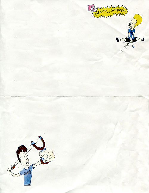
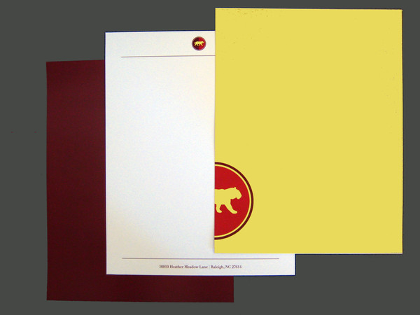
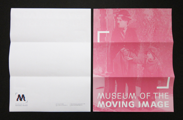
evolution of letterheads 1900 01 The Evolution of Letterheads Throughout The Years
evolution of letterheads 1900 02 The Evolution of Letterheads Throughout The Years
evolution of letterheads 1900 03 The Evolution of Letterheads Throughout The Years
evolution of letterheads 1900 04 The Evolution of Letterheads Throughout The Years
evolution of letterheads 1900 05 The Evolution of Letterheads Throughout The Years
evolution of letterheads 1900 06 The Evolution of Letterheads Throughout The Years
evolution of letterheads 1900 07 The Evolution of Letterheads Throughout The Years
evolution of letterheads 1900 08 The Evolution of Letterheads Throughout The Years
evolution of letterheads 1900 09 The Evolution of Letterheads Throughout The Years
evolution of letterheads 1900 10 The Evolution of Letterheads Throughout The Years

Latter part of the 20th Century

We saw the rise of radio and television during the latter part of the 20th century. With the rising advertising industry, the need for a corporate identity becomes more apparent. During this period we saw different changes and the rise of rebellious youth, which could’ve influenced the different design styles that were used during this period.
evolution of letterheads 1950s 01 The Evolution of Letterheads Throughout The Years
evolution of letterheads 1950s 02 The Evolution of Letterheads Throughout The Years
evolution of letterheads 1950s 03 The Evolution of Letterheads Throughout The Years
evolution of letterheads 1950s 04 The Evolution of Letterheads Throughout The Years
evolution of letterheads 1950s 05 The Evolution of Letterheads Throughout The Years
evolution of letterheads 1950s 06 The Evolution of Letterheads Throughout The Years
evolution of letterheads 1950s 07 The Evolution of Letterheads Throughout The Years
evolution of letterheads 1950s 08 The Evolution of Letterheads Throughout The Years
evolution of letterheads 1950s 09 The Evolution of Letterheads Throughout The Years
evolution of letterheads 1950s 10 The Evolution of Letterheads Throughout The Years

The 21st Century

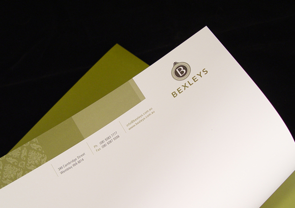
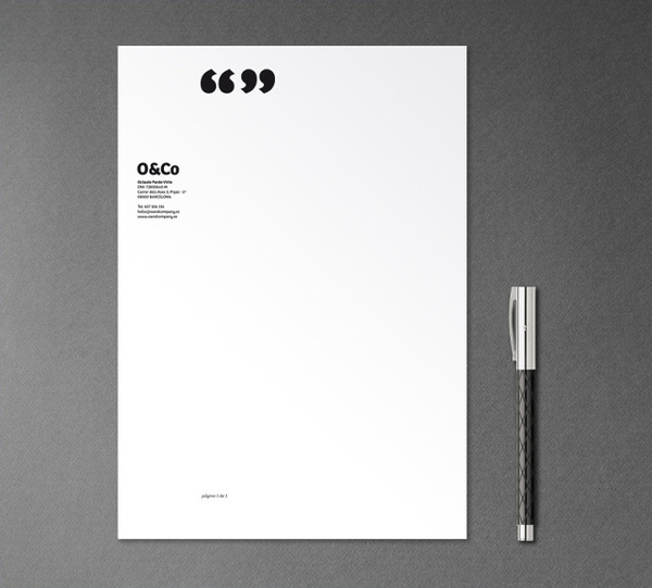
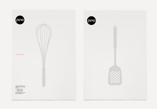
The current designs of letterheads has evolved – from the functional minimalist to the radical post-modern style of design. Designers today have a knack for combining different influences derived from past art movements; from Minimalism to conceptual art to post-modern styles of design.
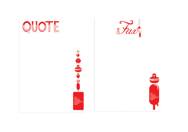
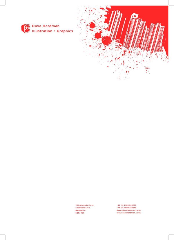
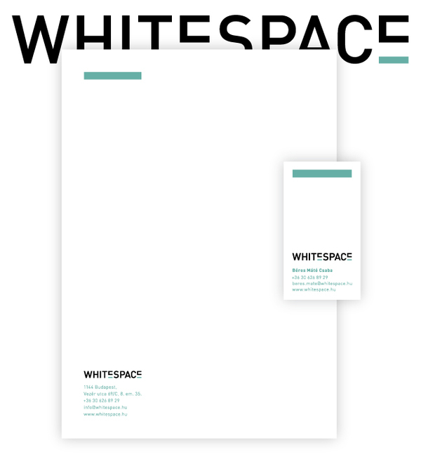
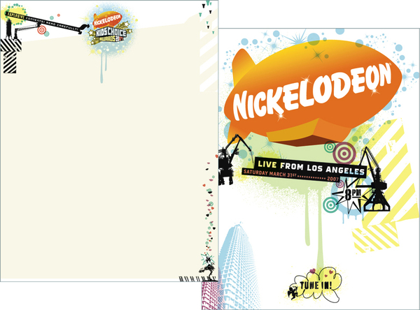
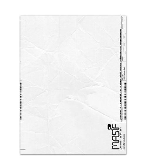
evolution of letterheads 2000s 01 The Evolution of Letterheads Throughout The Years
evolution of letterheads 2000s 02 The Evolution of Letterheads Throughout The Years
evolution of letterheads 2000s 03 The Evolution of Letterheads Throughout The Years
evolution of letterheads 2000s 04 The Evolution of Letterheads Throughout The Years
evolution of letterheads 2000s 05 The Evolution of Letterheads Throughout The Years
evolution of letterheads 2000s 06 The Evolution of Letterheads Throughout The Years
evolution of letterheads 2000s 07 The Evolution of Letterheads Throughout The Years
evolution of letterheads 2000s 08 The Evolution of Letterheads Throughout The Years
evolution of letterheads 2000s 09 The Evolution of Letterheads Throughout The Years
evolution of letterheads 2000s 10 The Evolution of Letterheads Throughout The Years
Letterheads has become played a pivotal role for a lot of people – from personalities to businesses – it has allowed people to create an identity for other people to know who they are, and what they do. It has provided an avenue for businesses to explore and reach out to the people.

Support Tan Kin Lian

If you support Tan Kin Lian for President of Singapore, you can leave your name and email address on this page: http://tiny.cc/3118j

McDonalds Baby»»»I nominate this Ad for Most Outstanding Commercial


McDonalds “Baby” is one of the nominations for Most Outstanding Commercial at the Primetime Emmy Awards being held on September 18 in Los Angeles. The commercial, launched in April 2010, features a dad whose attempts to keep his baby asleep involve driving around in the car in the night. He manages to get an order into the McDonald’s Drive Through attendant, but only by circling a few times.

McDonalds Baby


Credits
The McDonalds Baby ad was developed at TBWA\Chiat\Day by chief creative officer Mark Figliulo, copywriter Erik Fahrenkopf, art director Anthony Decarolis, executive producer Matt Bijarchi, senior producer (Media Arts) David Fisher.
Filming was shot by director Fredrik Bond via MJZ, Los Angeles, with director of photography Joost Van Gelder, executive producer Eric Stern and line producer Anita Wetterstedt.
Editor was Gavin Cutler at Mackenzie Cutler with assistant editor Mona Salma and executive producer Melissa Miller.
Music was produced at Human Worldwide.

SITF Award - British High Commissioner


This picture was taken at the SITF (Singapore Infocomm Technology Federation) Award ceremony. The tall gentleman in the picture was the British High Commission, Antony Phillipson. I asked him why he was so tall and he replied, "Yes, that is why I am called the 'High' Commissioner". 

Courtesy, SITF (www.sift.org.sg)