| Presbyterian Church |
 |
| Done by Malcolm Grear and Associates, it’s a true masterpiece of simplifying complexity. It appears a simple Cross shape but hidden inside are a dove, a clerical robe, a pulpit with bible, flames, and a fish. The below image will give you a better idea. |
 |
| Eighty20 |
 |
| The Eighty20 logo is a bit of a geeky one to figure out. The two lines of squares represent a binary sequence with the blue squares being 1’s and the grey squares being 0’s. This makes 1010000 which represents eighty and 0010100 which represents 20. |
| London Symphony Orchestra |
 |
| The logo looks like a single flowing line creating three initials L.S.O in air. But, the harmonious graphic of this logo marks the unbreaking rhythm of an Orchestra. |
| Yoga Australia |
 |
| At first glance the logo is a simple picture of a young girl doing her yoga but if you watch it carefully the body posture is creating the Australia Map. |
| The Brand Union |
 |
| Brand Union is a global leader in creative design consultancy, and the Union’s logo is a vivid example. The carefully chosen and placed black and blue shapes not only make the brand name but also enables the negative space do the same. |
| Northwest Airlines |
 |
| The old Northwest Airlines logo may look like a simple logo but if you take a closer look at the symbol on the left, it actually represent both N and W and because it is enclosed within the circle it also represents a compass pointing northwest. |
| Rehabilitation Hospital Corporation of America |
 |
| The highly symbolic logo of the Rehabilitation Hospital Corporation of America logo communicates a complex message with just a simple design. The globally renowned cross symbol represents help and medical attention and the steps reflects on the steps taken back to normal life. |
| Carrefour |
 |
| Carrefour in French means “Crossroads” and the logo shows two opposite arrows inside a diamond shaping the C letter with the negative space between them. |
| Piano Forest |
 |
| The Piano Forest logo may look like a simple text logo with trees above it, but if you take another look you will see that the trees actually represent keys on a piano. |
| The Guild of Food Writers |
 |
| The Guild of Food Writers (GFW) is an established organisation dedicated to excellence in food writing and culinary education. Mark closely and you can see a spoon inside the nib. |
| Schizophrenic |
 |
| Another logo that plays in representational symbols while relating heavily to the brand name is the Schizonphrenic logo. Being a medical disorder that often depicts split personalities, the logo characterises this with simple shapes that depict a happy and sad face. |
| Museum of London |
 |
| The Museum of London logo may look like a modern logo design but it actually represents the geographic area of london as it grew over time. |
| GreenLabs |
 |
| This logo is just not a simple green tree, but if you look at the tree crown, you’ll see that it can also be interpreted as a brain. The logo lays emphasis on the strong intellectual capabilities of the company’s staff and also reflects ‘green’ and ‘labs’ parts of their name. |
| Big Ten |
 |
| The Big Ten collegiate conference has eleven schools but they didn’t want to change their name. However, they used their logo to hide the numerical “11” in the name. |
| Toblerone |
 |
| The Toblerone logo contains the image of a bear hidden in the Matterhorn mountain, which is where Toblerone originally came from. |
| Treacy Shoes |
 |
| The Treacy Shoes logo is very cute logo with a shoe hidden between the t and s. |
| Milwaukee Brewers |
 |
| The old Milwaukee Brewers logo may look like a simple catchers mitt holding a ball, but if you take a second you will see the team’s initials M and B. |
| Elle Hive Tractor |
 |
| It is a company which designs compact tractors. The letters “E” and “H” make up the symbolic image of a tractor. |
| Sun |
 |
| The Sun logo is one of the most famous ambigrams in the world. You can read the brand name in every direction; both horizontally and vertically. This logo was designed by professor Vaughan Pratt of the Stanford University. |
| FedEx |
 |
| The FedEx logo looks like a plain text based logo but if you take a second look between the E and the x, you will see an arrow which represents the speed and accuracy of the company’s deliveries. |
| Amazon |
 |
| The Amazon logo is an extremely simple logo and while the arrow may just look like a smile, it actually points from a to z. This represents that Amazon sells everything from a to z and the smile on the customers face when they buy a product. |
| Newman |
 |
| The reversible Newman logo is simple yet classy. |
| A.G. Low Construction |
 |
| In this logo, the name of the company is written in thin, square letters that hold a great purpose; they are designed to look like the floor plan of the house, which happens to be the company’s specialty. |
| Cattleyard |
 |
| Being music related business; the creator of this logo has used various graphics of musical instruments to form the overall shape of a cow. Clever example of combining the graphical elements to express a company’s name. |
| Baskin Robbins |
 |
| The Baskin Robbins logo may look like including a simple BR above the name but if you take another look you will notice that it includes a pink number 31. This is a reference to the original 31 flavors. |
| Formula 1 |
 |
| At first, this logo might not make much sense. But if you look closely, you’ll see the number 1 in the negative space between the F and the red stripes.This logo also communicates a feeling of speed. |
| Egg n Spoon |
 |
| In this logo, the negative space cleverly show egg and spoon which is the brand’s name. |
| Sony Vaio |
 |
| Sony Vaio is a well known brand of laptops. But did you know that the name Vaio logo also had a hidden meaning? Well, the first two letters represent the basic analogue signal. The last two letters look like a 1 and 0, representing the digital signal. |
| Lafayette |
 |
| If you’ve ever visited one of the famous stores in Paris – Galeries Lafayette, you will notice that it’s logo represents Paris with its joined letters “t” to form Eiffel Tower. |
| Forkwire |
 |
| Being an Online Food Delivery service, its logo shows a fork formed into an @ symbol. |
Sunday, May 15, 2011
30 Brilliant Logos With Hidden Messages

Konad Cosmetics Flobu Waterproof: We broke up, I’m pregnant, He’s married
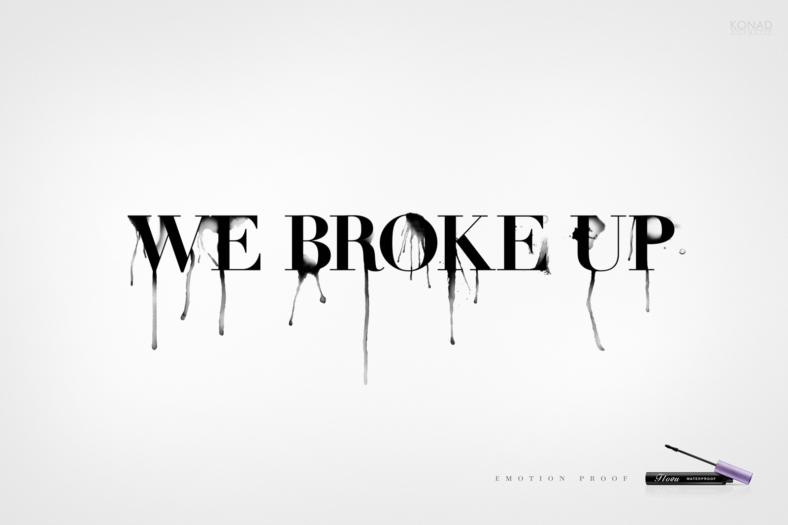


Advertising Agency: Grey, Buenos Aires, Argentina
Executive Creative Directors: Pablo Gil, Sebastian Garin
Creative Directors: Daniel Fierro, Gonzalo Ricca
Copywriters: Hernan Kritzer, Rodrigo Greco
Art Directors: Lisandro Cardozo, Tomas Duhalde
Agency Producer: Sergio Bonavia
Retoucher: Juan Carlos Erasmo
Monday, May 9, 2011
"The garbage thrown on the sea returns someday. For everybody."
Script has created an action for Surfrider Foundation Brasil, called "Return". The action has as purpose to raise awareness and alert people about the consequences of the garbage left on Rio's beaches.
From a mailing list of surf shops and accredited NGOs, 10,000 boxes containing objects thrown on the sand were sent to people's houses.
Besides plastic cups, ice-cream packages, cans and water bottles, each box also contained a label with the following message:
"The garbage thrown on the sea returns someday. For everybody." -- leaving it clear that, even who never threw garbage on the beach, one day, may suffer the consequences of such act.
The action was also performed in bars in the city of Rio de Janeiro.
Technical profile:
Agency: Script
Creative Director: Ricardo Real e Marcello Mendes
Copywriter: Felipe Machado
Art Directors: Thiago Manhães & João Paulo Medeiros
Production Company: TCO Filmes
Executive Production: JP Braga
Director: JP Braga
DP: Nando Azevedo & Fernando Fernandez
Edit: JP Braga
Color Grading: Nando Azevedo
Soundtrack: Buena Musica (Daniel Medeiros, Leo Cruz, Marcelo Frota)
Playboy Interview Garage Tour
Advertising Agency: Grey, Buenos Aires, Argentina
Executive Creative Directors: Pablo Gil, Sebastian Garin
Creative Directors: Daniel Fierro, Gonzalo Ricca
Copywriter: Hernan Kritzer, Rodrigo Greco
Art Director: Lisandro Cardozo, Tomas Duhalde
Btl Creative Director: Esteban Lorenzut
Production Company: Rebolucion
Director: Nicolas Nubile
Producer: Jorge Larrain
Agency Producer: Topo Barrios, Sergio Bonavia
Web Designer: Martin Bekerman
Copywriter: Hernan Kritzer, Rodrigo Greco
Art Director: Lisandro Cardozo, Tomas Duhalde
Btl Creative Director: Esteban Lorenzut
Production Company: Rebolucion
Director: Nicolas Nubile
Producer: Jorge Larrain
Agency Producer: Topo Barrios, Sergio Bonavia
Web Designer: Martin Bekerman
Sunday, May 8, 2011
Celebrate Mother's Day
British retailer Debenhams this year ran a Mother’s Day promotion, calling on viewers to make their mums feel special on Mother’s Day, celebrated on April 3 in the UK. A television commercial presents children and adults calling out to their mothers in their time of need. The ad finishes with the line, “Make whats-her-name feel special this Mother’s Day”, and takes viewers to a Feel Special microsite where they can send the film as a personalised movie e-card. Debenhams donated 5% of the price of online orders to the charity Breast Cancer Campaign when purchases were placed via the e-card page.

Click on the image below to play the Mothers Day video in YouTube (HD)

Credits
The Debenhams Mothers Day campaign was developed at JWT, London, by executive creative director Russell Ramsey, creative director Nicholla Longley, art director Simon Horton, copywriter Hannah Ford, agency producer Roy Swansborough, account director Alex Clarke. Media was handled at Carat.Filming was shot by director Joanna Bailey via The Bare Film Company. Editors were Melanie Oliver and Colin Hannan. Sound was designed by James Forbear.
Friday, May 6, 2011
China bans ad words

Hoping bureaucrats in Washington pick up on the trend and impose fines for "Revolutionary" and "100% Free."

Monday, May 2, 2011
35 Creative and Effective Public Interest Ads
Advertising, in its non-commercial guise, is a powerful educational tool capable of reaching and motivating large audiences. “Advertising justifies its existence when used in the public interest – it is much too powerful a tool to use solely for commercial purposes.” Attributed to Howard Gossage by David Ogilvy.
Public service advertising reached its height during World Wars I and II under the direction of more than one government. Here we have collated some of the most creative and effect public interest ads. Can you get the message from those ads too?
It’s Time To Get Your Hands Dirty.

Now that the well has been sealed and the leaking has stopped, do your part. Join A Bird In Hand Project and donate now.
Asphaltisation

The longer you live on the street, the harder it is to get off it.
Different Faces

When a tree falls, it takes other lives with it.
No Career Resists Alcoholism

Self Clean

Unfortunately the beach doesn’t clean itself.
Child Safety

Protect your child’s room from violence.
Don’t Suffer In Silence

Slut. Words hurt. You can’t see them but the scars from verbal abuse are real and can last for years. Don’t suffer in silence.
Animals Suffer Like We Do

Put yourself in a mink’s place.Don’t buy animal skins!
See You On The Road

For more understanding on the roads See You On The Road-> Use reflectors
Affiche Robot

Time to Neuter Your Dog

Biodiversity And Biosafety Awareness

What will it take before we respect the planet?
Don’t Drink and Drives

What’s the price of a bottle of beer?
Help Mother Nature To Fight Back

Nothing We will Ever Bring Them Back

Help Us to Keep The Ocean Clean

When we pollute the sea, we pollute for a long time.Help us to keep the ocean clean.
Smoke Deaths

Terrorism-related deaths since 2001: 11,377. Tobacco-related deaths since 2001: 30,000,000
The Gifts

Anatomy Model Woman

Vegetables are all your body needs.
Sleepiness is Stronger Than You

Sleepiness is stronger than you.ThaiHealth. Don’t Drive Sleepy Project
Poor Boy

You can lose more than your patience.
15th Annual Chief of Police Dinner Gala

Would You Care More If I Was A Rhino

Would you care more if I was a rhino?
When They Speak

When they speak, we listen. Conservação Internacional
Bossy Boot

When he controls your life, it’s no longer your life.
Feed on Milk

If you don’t help feed them, who will? Please call Concordia Children’s.
Polar bear

The earth is heating up.
Shark Tattoo

Set harm, get harm.
As Big As Its Benefits

Rodoanel, the biggest road work in Brazil, is ready. As big as its benefits. That’s the only thing people talk about: Rodoamel facilitates the draining of the national production to the biggest post in the country.
Talk to Someone Else

Talk. To someone else. Don’t encourage domestic violence.
The Tuna

Only a tenth of the catch in long line tuna fishing is actually tuna.
Regenerate Horse

Help neglected animals leave their old lives behind.
Saving a National Treasure

The Crayfish had pharmaceuticals for breakfast and a Catfish had him for lunch and you had the Catfish for dinner. The Susquehanna runs through you. Protect it. Protect yourself. Dispose of chemicals and pharmaceuticals responsibly. And limit fertilizer use.
Close Stool

Due to the lack of toilets that are specifically designated for their needs, our disabled friends run into many frustrating moments during the course of their day. Are you aware?
Lungs

Before it’s too late
Subscribe to:
Posts (Atom)